
Ten colours to try
| Colour | Digital reference | Where it could work |
|---|---|---|
| Sage green | #D0E6D2 | A soft green to pair with foliage and neutral fabrics. |
| Ivory | #F5F5DC | A pale neutral for stationery, flowers or table details. |
| Dusty rose | #D5A6BD | A muted pink that works with greenery and warm metals. |
| Ocean blue | #4A90E2 | A brighter blue for coastal details or a contrasting accent. |
| Terracotta | #E2725B | A warm orange-brown to pair with natural textures. |
| Champagne | #F7E7CE | A pale warm tone for a gentle accent. |
| Lavender | #CBC3E3 | A soft purple for flowers or small stationery details. |
| Charcoal | #2E2E2E | A dark neutral to contrast with lighter colours. |
| Coral | #FF6F61 | A bright pink-orange when you want a stronger accent. |
| Cinnamon | #8B5E3C | A warm brown to combine with wood, linen or foliage. |
Check real samples
A screen colour is only a starting point. Fabric, flowers, paper and printed ink can look different in daylight or indoor lighting. Compare samples together before ordering.
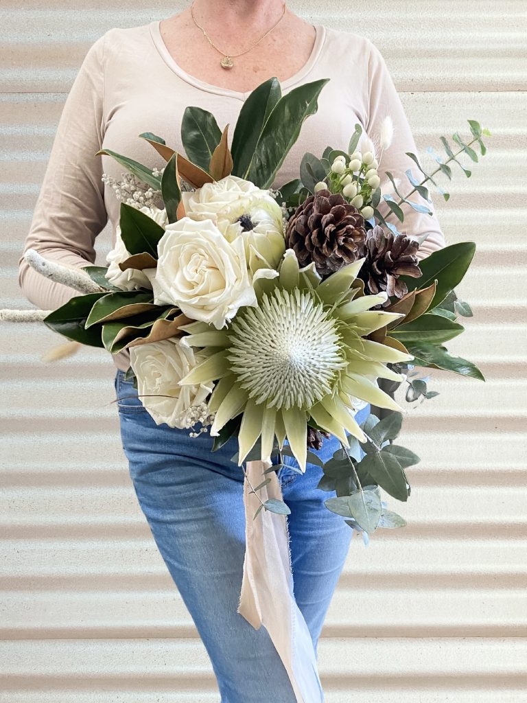
Ask your florist which flowers suit the season and conditions. A flexible colour preference can be easier to work with than a request for one exact bloom.
Use colour where it helps
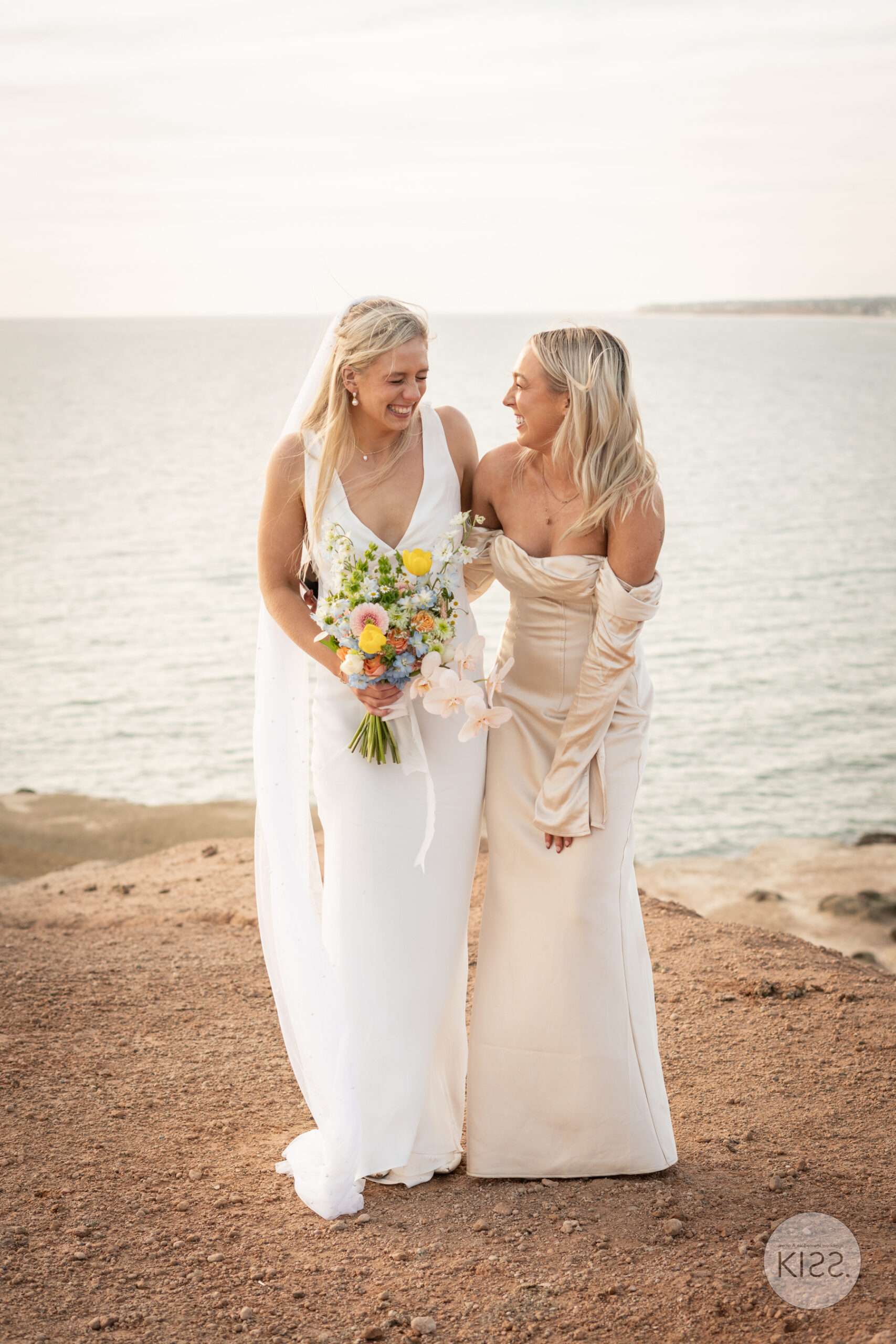
Your bouquet, stationery, clothes and a few table details can carry the palette. You do not need to match every item or cover a beautiful setting with decorations.